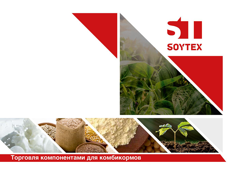
 The growth and advancement of any company sooner or later require renewal and a desire to present itself in a new way. “TD “Belagro ” has been operating for more than 10 years, gradually expanding and year after year reaching new heights. In its new decade, the company has decided to move with a new name and announces a rebranding that has taken place.
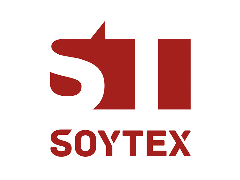
The rebranding affected the name and logo of the company; more than 130 designers took part in the development of the sign. From now on, the company will carry out its activities under the name "Soytex".
The growth and advancement of any company sooner or later require renewal and a desire to present itself in a new way. “TD “Belagro ” has been operating for more than 10 years, gradually expanding and year after year reaching new heights. In its new decade, the company has decided to move with a new name and announces a rebranding that has taken place.
The rebranding affected the name and logo of the company; more than 130 designers took part in the development of the sign. From now on, the company will carry out its activities under the name "Soytex".
The new name managed to organically combine two main communication messages: 1. The main product of the company's basket of goods (soy, translated from English. "Soya beans"). 2. Activities related to export-import operations (import-export).
The modernity of the brand is emphasized in the logo by the construction of the ST mark itself. The laconic type work is done in such a way that the typography does not argue with the emblem itself; moreover, it reveals its essence. A simple and at the same time complex sign reflects our approach to work: it is simple and easy to work with us, but we are not afraid of non-standard tasks and are constantly looking for new solutions. The absence of borders of the sign is a symbol of openness to cooperation, fresh ideas and projects. We stayed true to the color red because it is the color of movement and energy. The color of a dynamic and progressive team with an active lifestyle.
The new name is not just a symbol of change. The new name is a symbol of new qualities: accessibility, safety and mobility. This is a new system of images, associations, a new approach and new opportunities in a rapidly developing agro-industrial environment.
Forward to new achievements, we will become a reliable guide for you.
Welcome to Soytex!